MANTL

MANTL

Helping financial institutions and their customers open accounts faster with higher deposits.

Helping financial institutions and their customers open accounts faster with higher deposits.

Timeline

8 months

8 months

Deliverables

Prototype, UI component library/Design system, video walkthroughs, and research

Prototype, UI component library/Design system, video walkthroughs, and research

Role

Lead Product Designer

Lead Product Designer

Team

Conner Cousins, Steve Gengler, Fo Neale-May, Melissa Bellah, Leopold Wicht, and Michael Noel.

Conner Cousins, Steve Gengler, Fo Neale-May, Melissa Bellah, Leopold Wicht, and Michael Noel.

The problem

The problem

MANTL is a FinTech startup focused on improving the way consumers and businesses open bank accounts. Currently, MANTL has a v2 product focused on only consumer bank account opening. They have an industry-leading conversion rate of 29% on all account opening applications, with one of the highest average opening deposit amounts of $5,000. MANTL also offers a back-office enterprise solution called Console, which helps financial institutions track and manage all applications. If MANTL can create a solution that focuses on business bank account opening while improving the experience for consumer bank account opening, it will open up more addressable markets for them to upsell or sell to new institutions.

Key areas of focus with moving from v2 to a v3 solution:

• Improved web and mobile experience
• Business account opening application
• Increase initial deposit amount on mobile devices

Gathering requirements

Gathering requirements

MANTL worked with American Business Bank (ABB) to gather requirements for business account opening. As a team, we would take in those requirements and prioritize the features/functional requests based on effort and demand. Once the prioritization was complete, we would put the requests into a backlog and then story point each ticket for the upcoming sprint. After the designed solution passed the executive sign-off, I would set up a moderated usability test with our CS (customer success) team to ensure that solution we put together worked and solved the problem. When the solution was in a stable, testable state, we would share our QA environment with ABB to receive feedback on the solution. We prioritized our work for consumer bank account opening to follow what part of the application we were working on for business bank account opening.

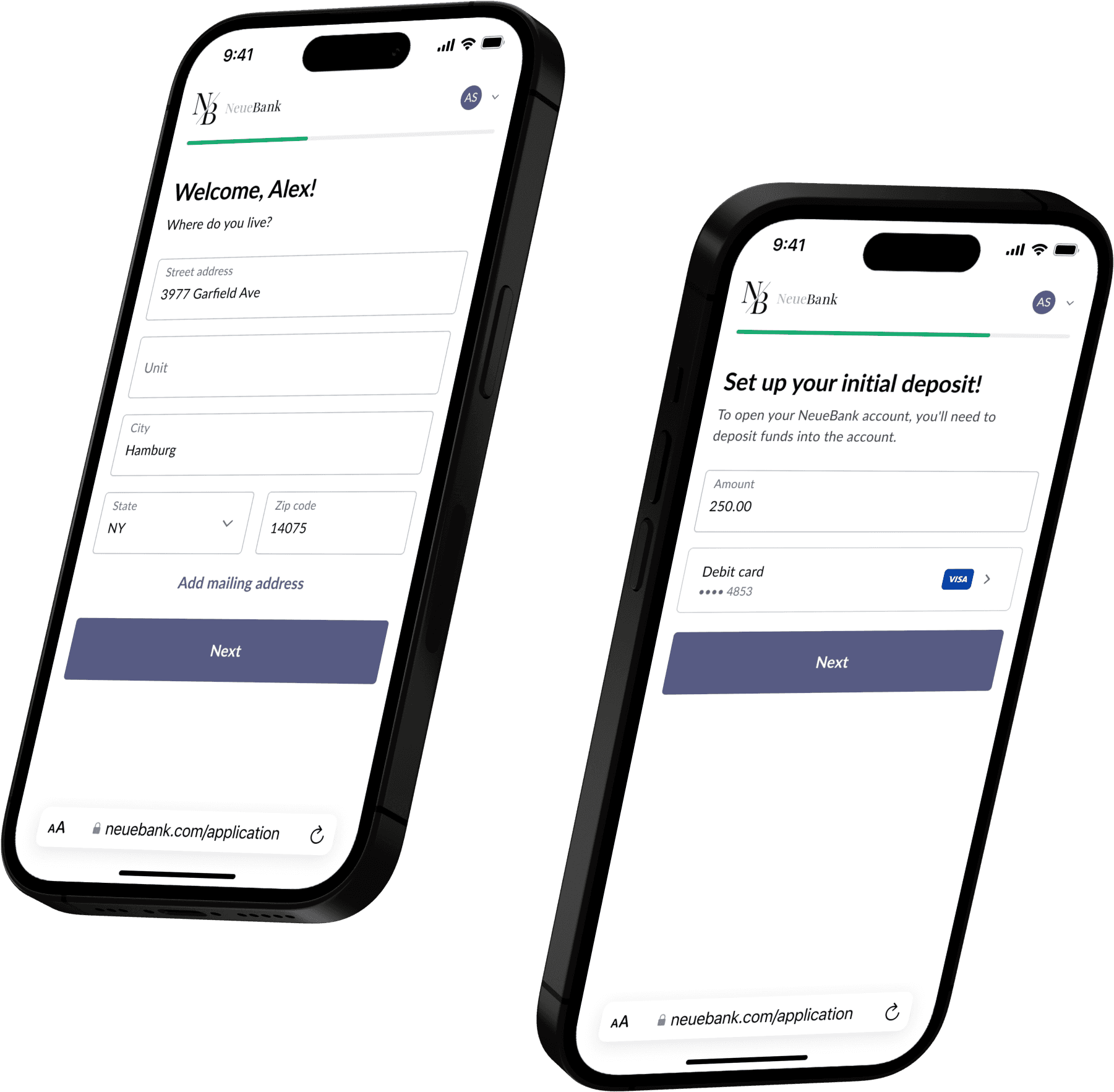
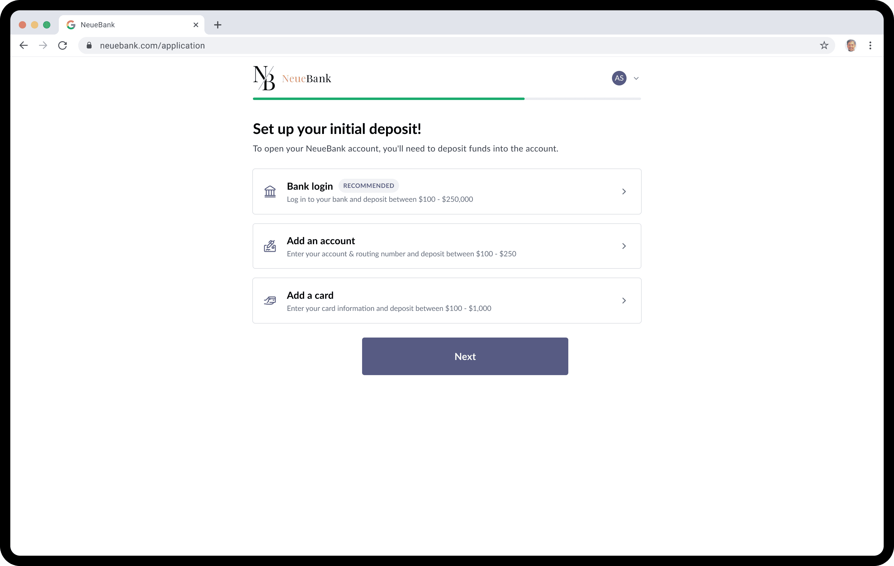
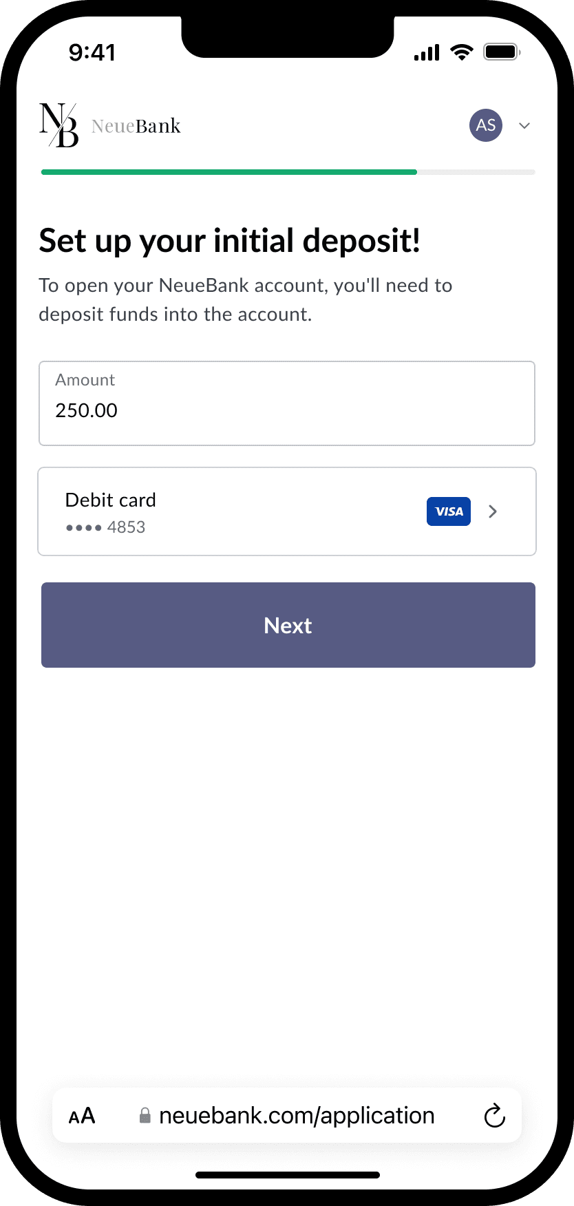
With having a baseline for conversion numbers on the consumer application, we looked at the most significant drop-off points in the application to test and improve the experience. Once we finalized the parts of the application that we wanted to improve, which were application hierarchy, simplified progress indicator, and increased initial deposit amount on mobile, we prioritized this along with the parts of the application that we were working on during that sprint.

Competitive analysis

Competitive analysis

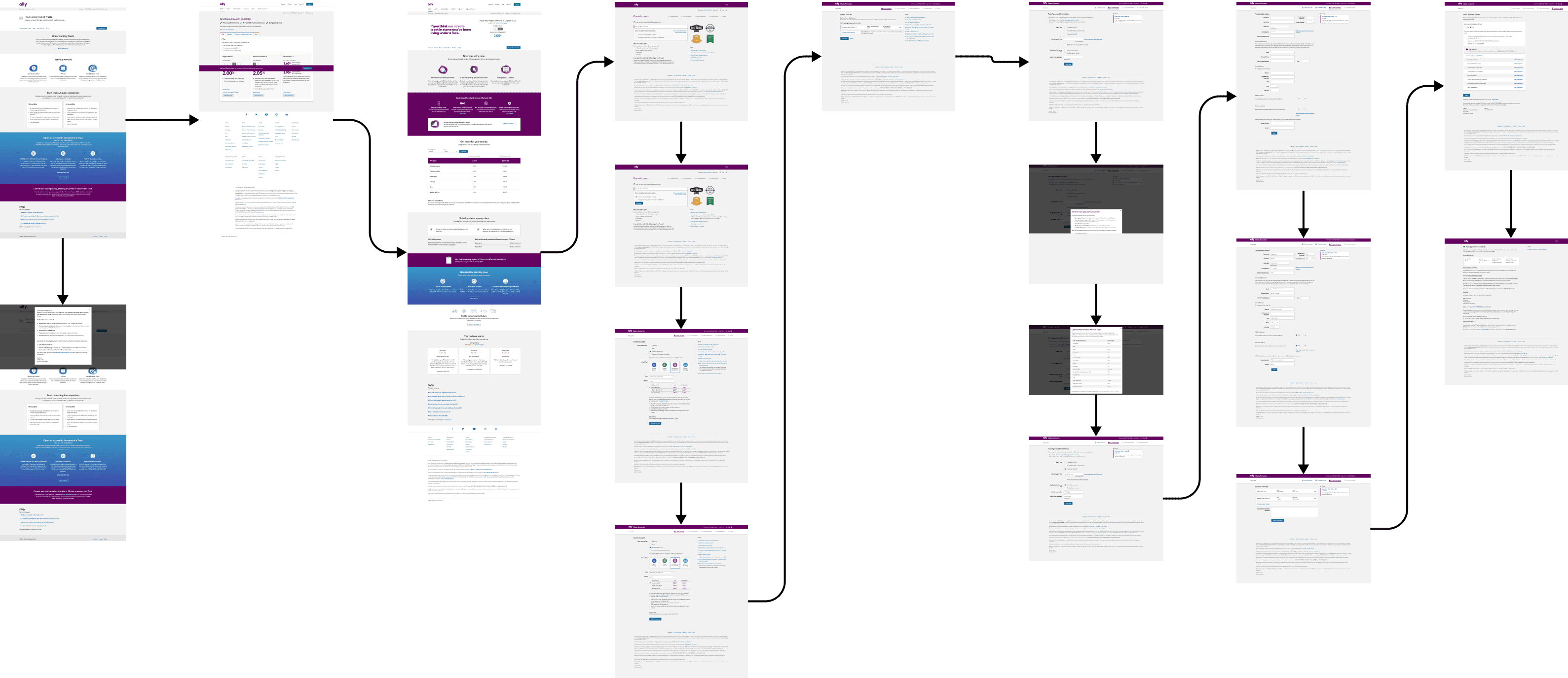
To better understand the landscape of account opening, I gathered screen captures of our competition and other application flows in the FinTech space. Then, I laid out all of the screens captured in Figma and shared my thoughts on the positives and negatives from each application flow. Doing this helped lay out my thought process on what makes for a great experience when filling out an application.

Initial designs

Initial designs

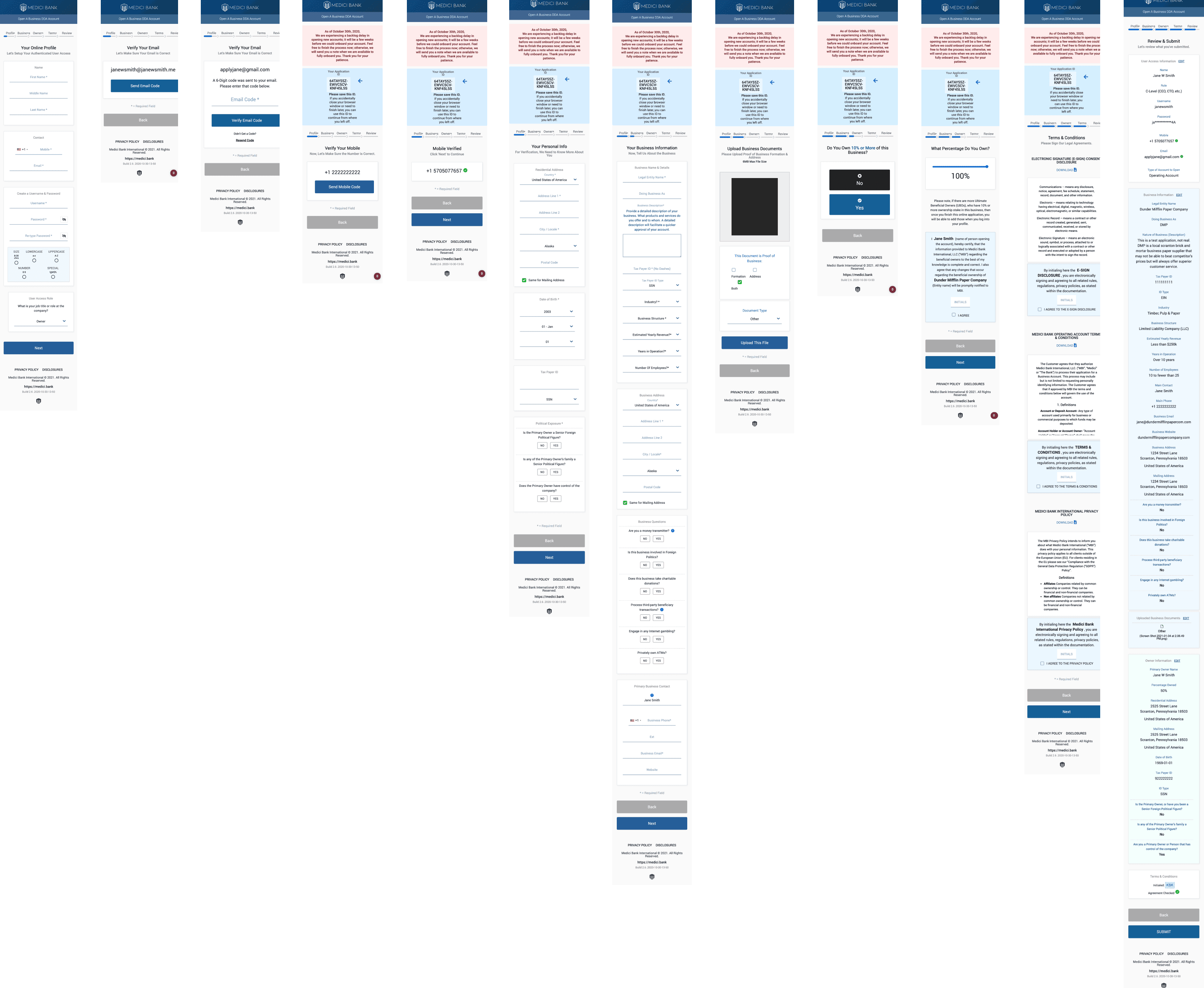
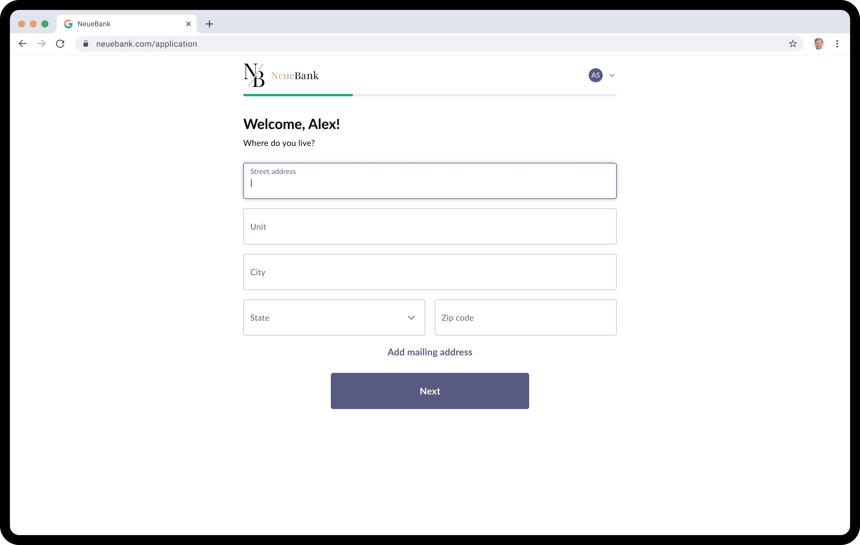
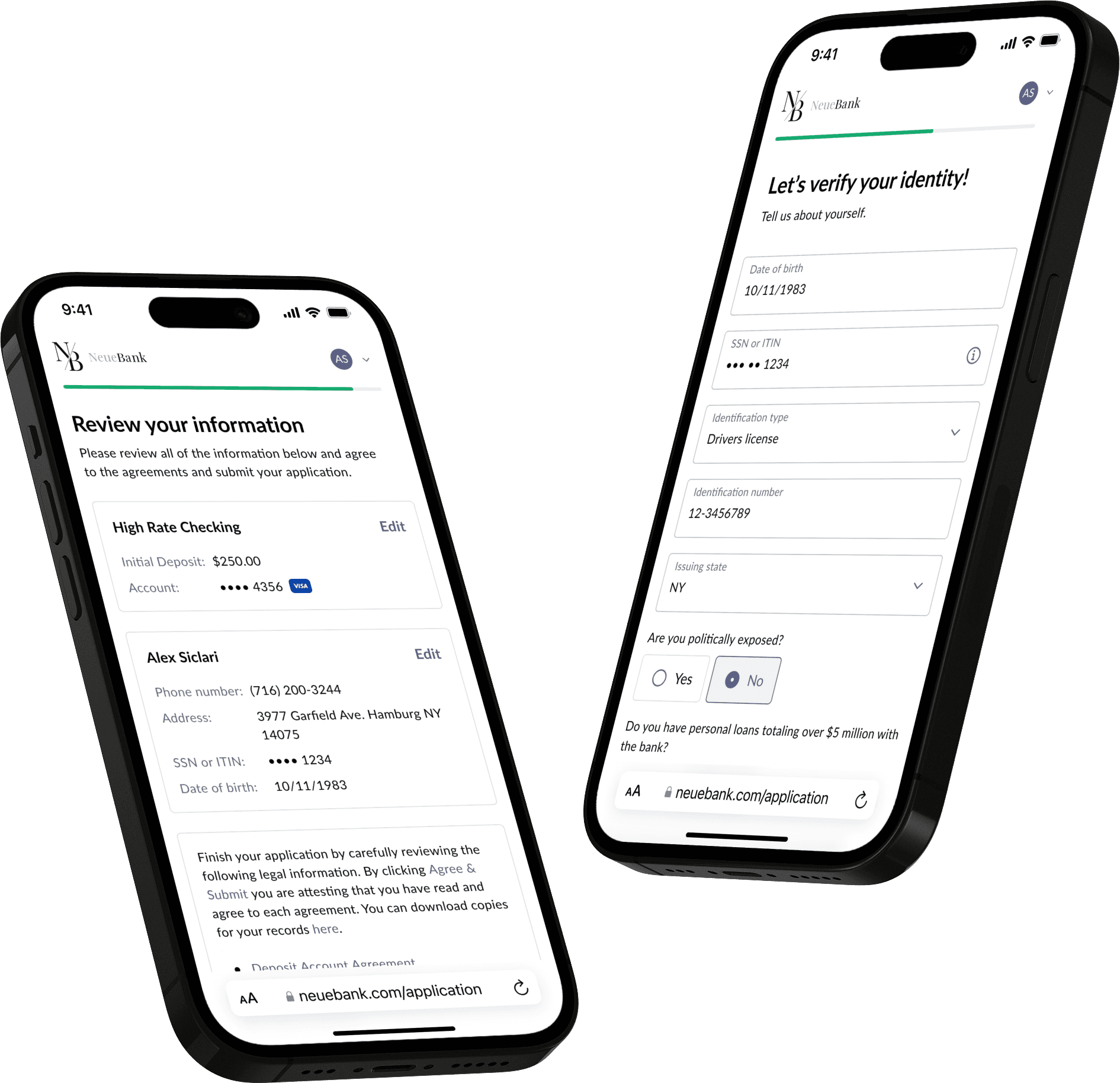
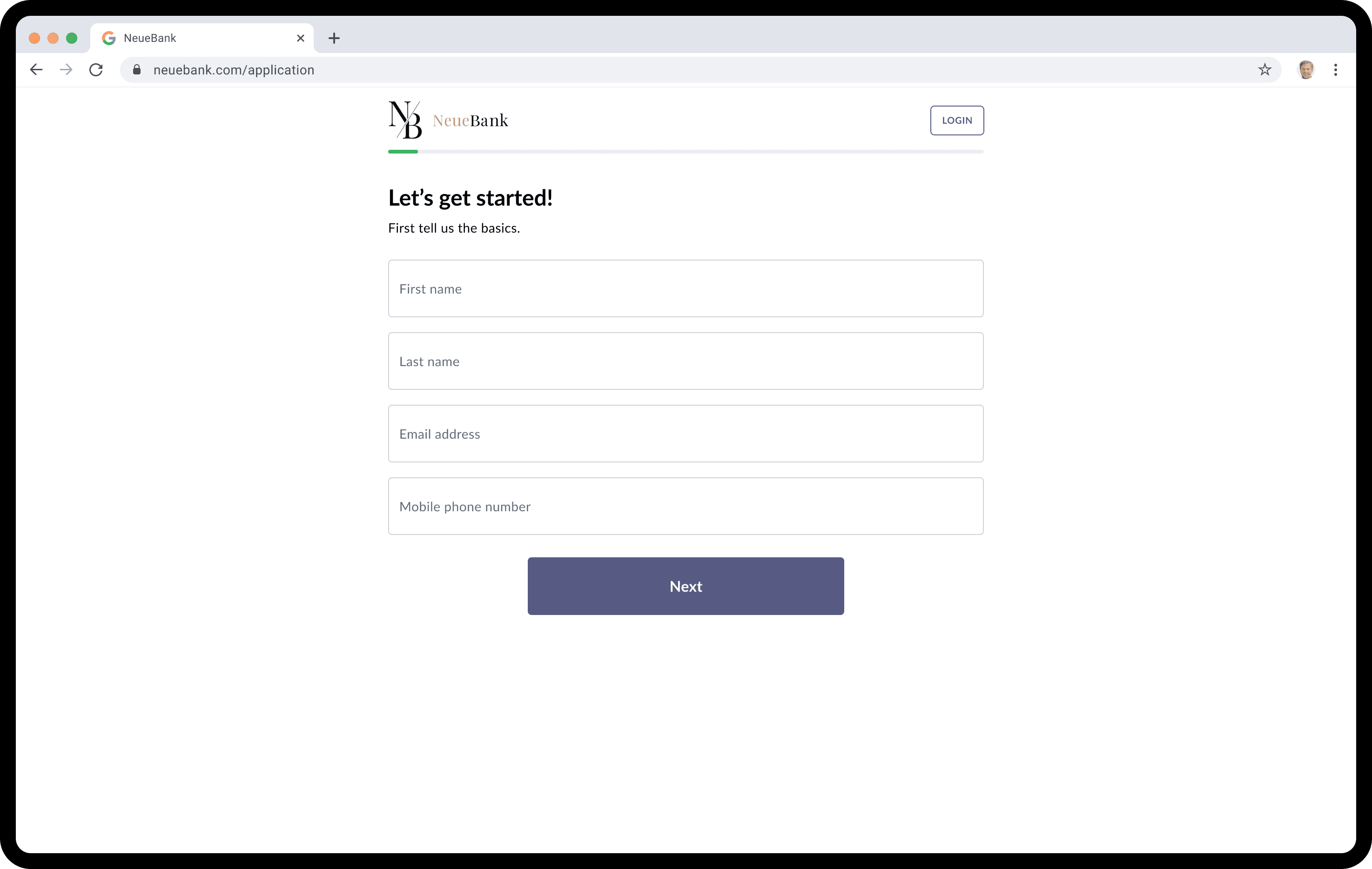
With the original goals and assumptions that we came into the project with, we focused on a single-page solution that would scroll to the next section when a user completed one section. We looked to help solve some of the routing issues in the v2 solution by having a single-page application. We had a way for the users to scroll up and down to sections by selecting one of the cards on the left column that would indicate when a section was complete.

Feedback

Feedback

As we started to share the work and receive feedback, a few areas came back that we wanted to improve.

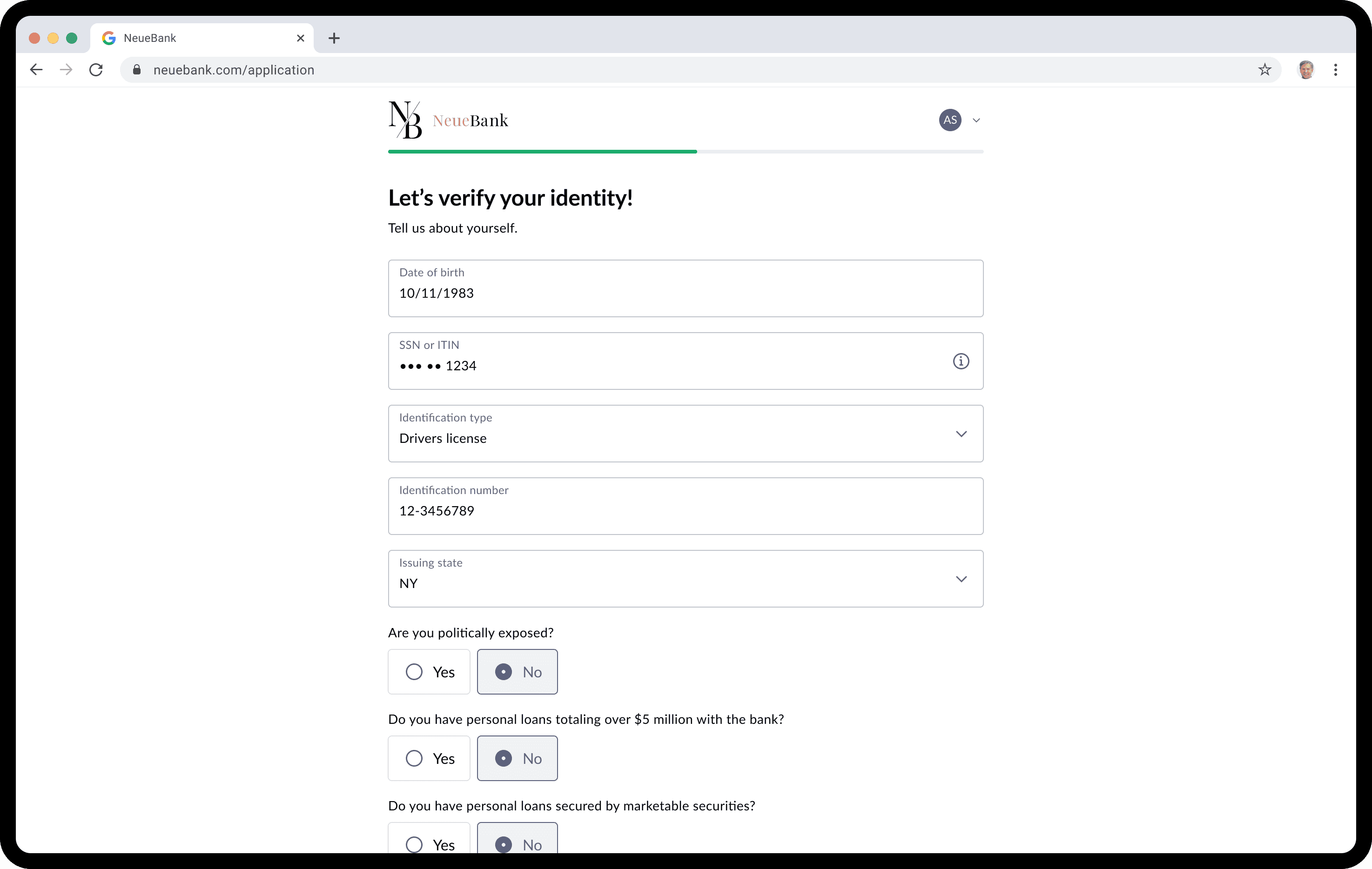
• Length of Applications: The vast difference between the size of a consumer application, which was the only application that MANTL took up to this point, was much shorter and easy to navigate and complete. The increased difficulty regarding the type of information needed to complete and the number of people that could be on one application was too much for a single-page application.

• Improved Hierarchy: We still needed an improved hierarchy with the title and subtitle of sections. We also needed to improve the readability of the sections by using left-aligned text instead of center-aligned text.

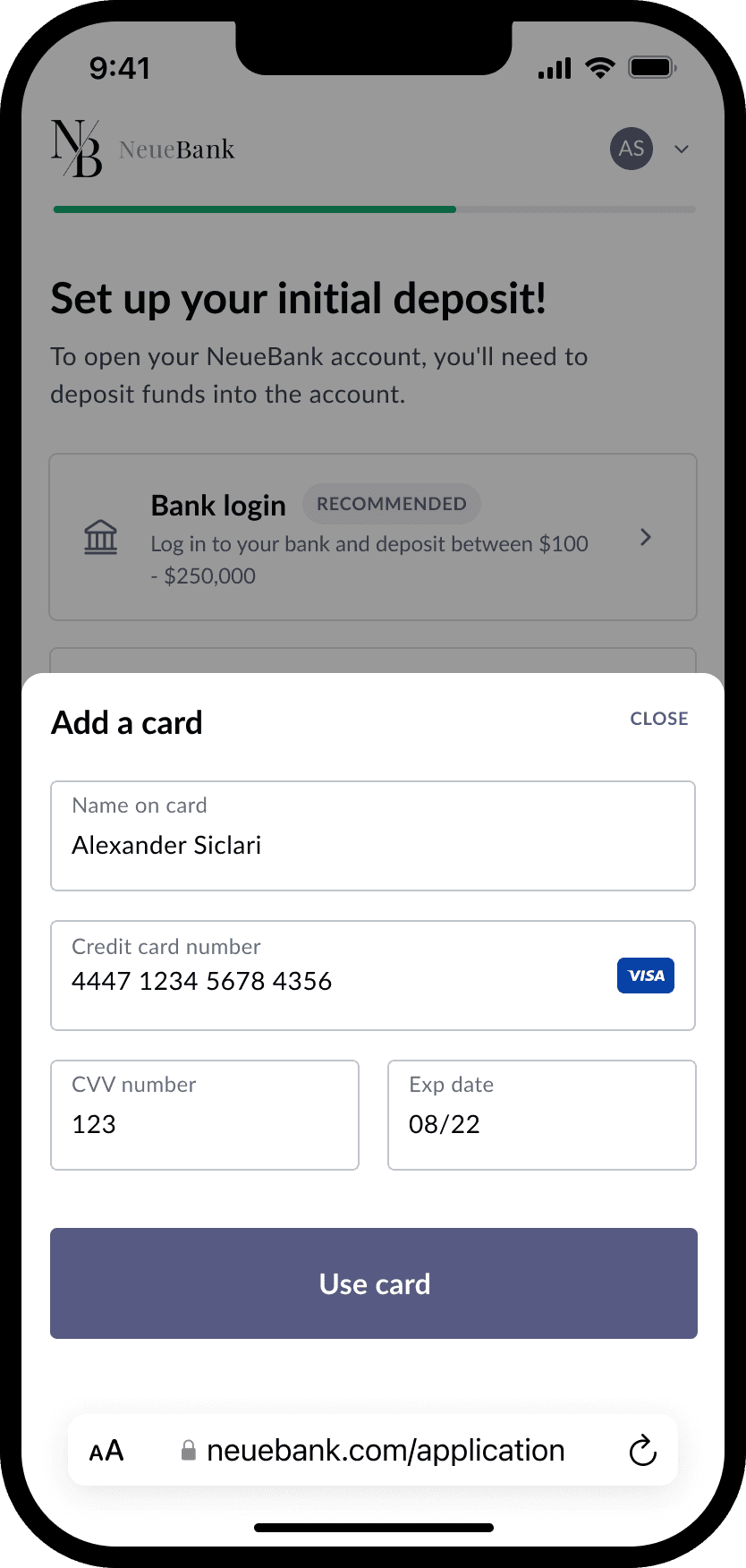
• Grouped Inputs: We went for this approach in the first place to try and scale down some sections with all of the margin between input fields for the business application. We also wanted to think of a way to keep the grouped inputs for data collection associated with each other for validation purposes. Having grouped inputs could trigger multiple error states inside that set of grouped inputs, leading to either stacked errors under the grouped inputs or individual errors popping up under the grouped inputs until all errors were accounted for.

Final designs

Final designs

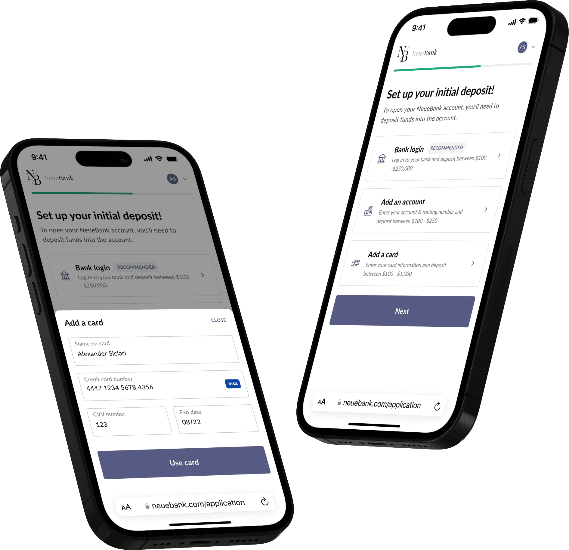
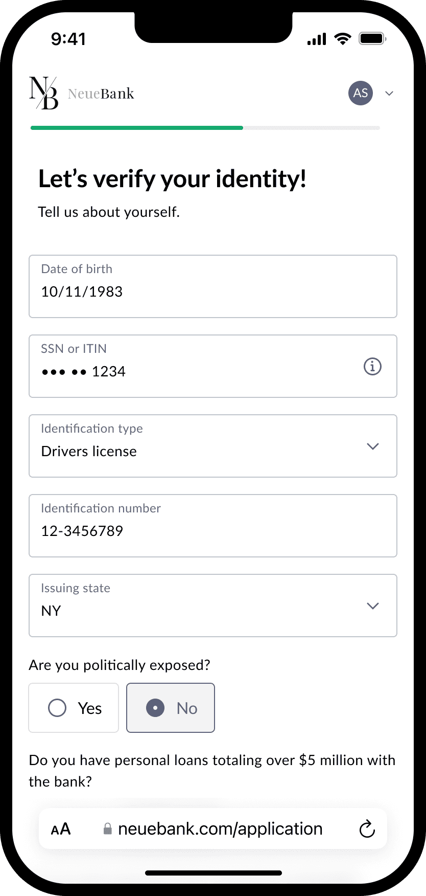
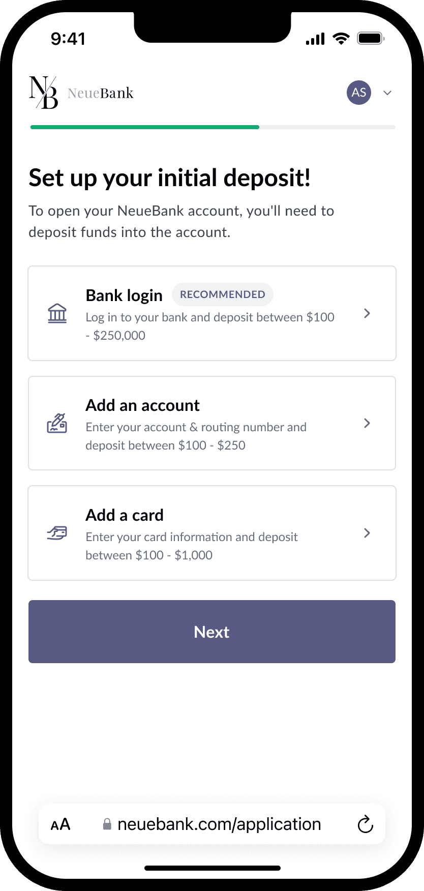
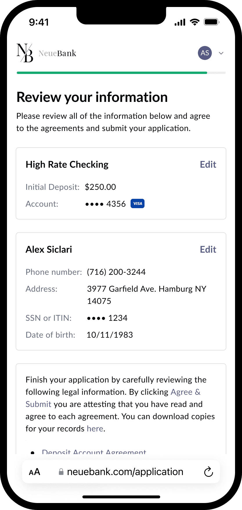
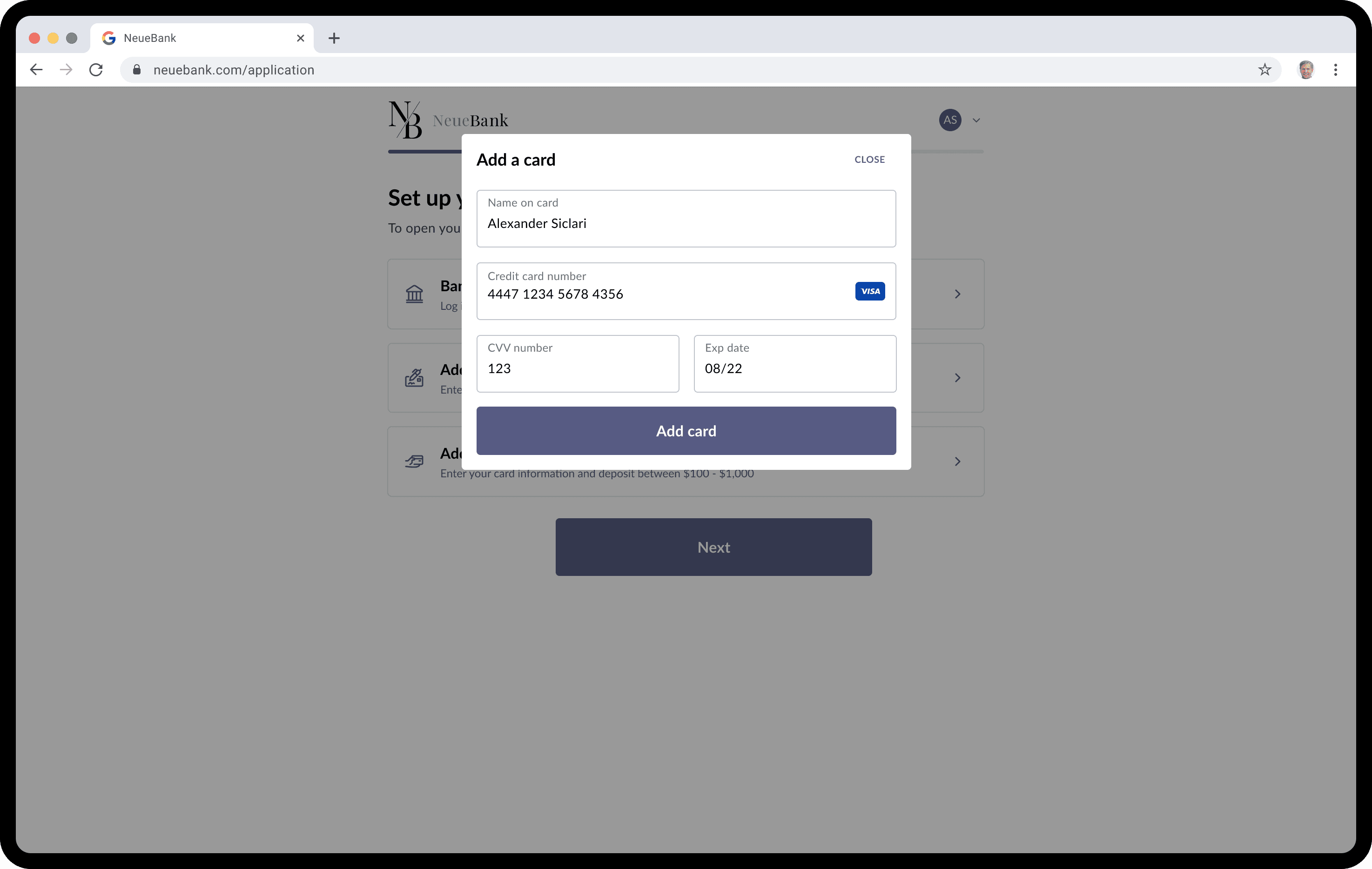
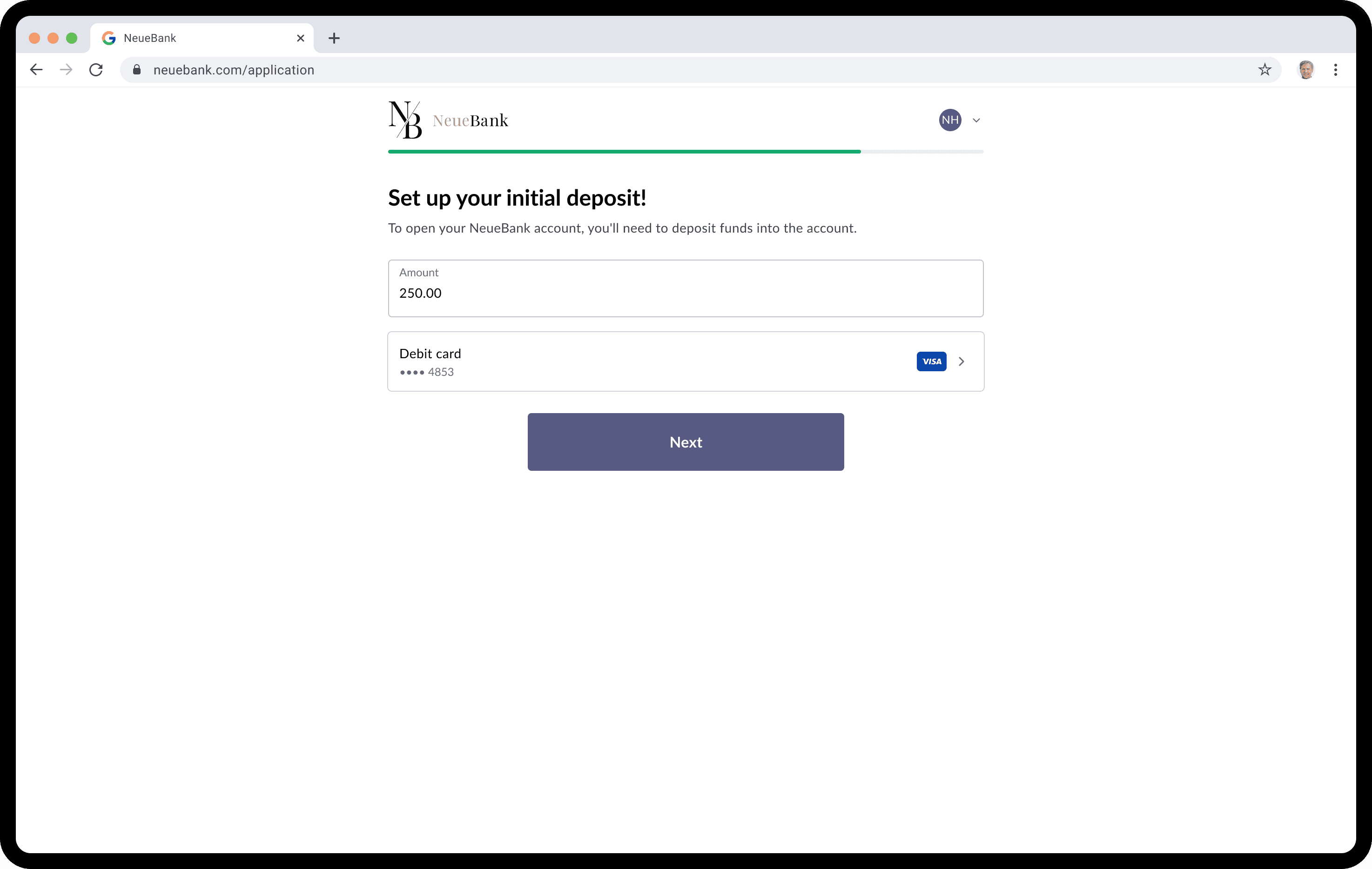
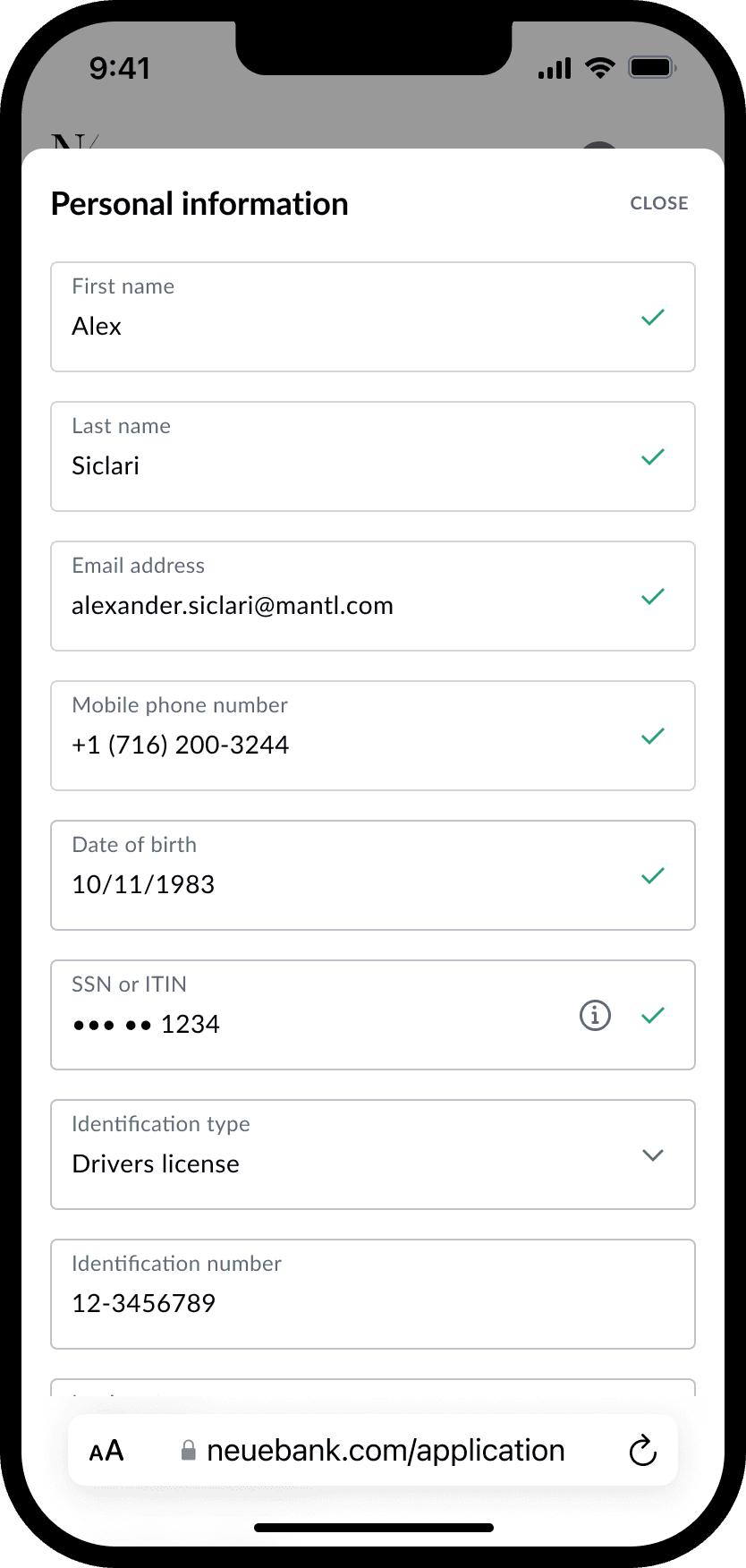
After multiple rounds of iteration and usability testing, we shifted back to a stepped approach for the application, and it made a huge difference. Users responded positively to the simplified layout, saying it was easier to digest information one step at a time without being overwhelmed by the full form. We cleaned up routing issues by streamlining user flows and leveraging native browser behavior for navigation, which felt more intuitive than the previous card-based system. We also tightened up the hierarchy by increasing title weight and aligning text for better readability, and refined the progress indicator so it complemented the institution’s branding without competing for attention.

Web mobile designs

Web mobile designs

Getting started

Identity verification

Identity verification

Selecting deposit source

Selecting deposit source

Card information

Card information

Enter deposit amount

Enter deposit amount

Review and sign

Review and sign

Web large screen designs

Web large screen designs

Getting started

Getting started

Identity verification

Identity verification

Selecting deposit source

Selecting deposit source

Card information

Card information

Enter deposit amount

Enter deposit amount

Review and sign

Review and sign

Impact

Impact

Account opening deposit

We increased the average initial deposit on mobile screens by adding a step with the deposit amount as the focused input field compared to the v2 solution, which was below the viewport on a mobile device. By doing this, people no longer missed the input field when they would scroll down to continue to the next step in the account opening process.

$75.00

Before

$500.00

After

Decreased completion time

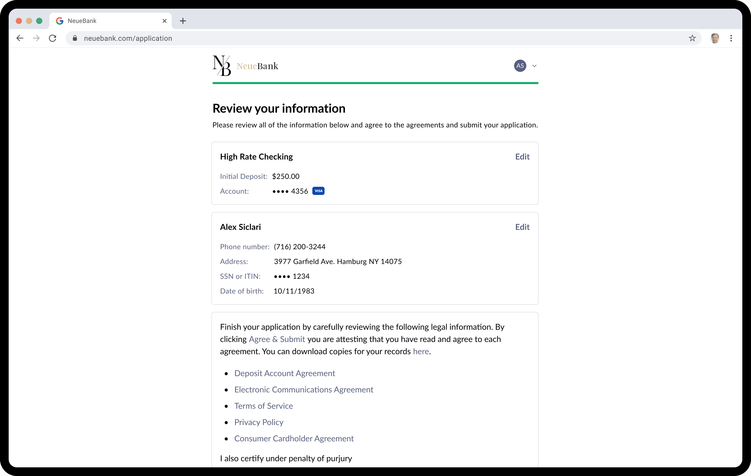
By giving users a simplified stepped approach for the application and adding a step where people could review all of their information, we found that it reduced the time that a user would need to navigate back and forth between steps. By doing this, we ensured that a user could fix all of their information and cutting down on routing issues and time to complete the application.

15:45

Before

5:40

After

Additional case studies

Additional case studies

  • 15 min read

  • 15 min read

  • 15 min read

  • 15 min read

  • 15 min read

  • 15 min read

  • 15 min read

  • 15 min read

  • 15 min read

  • 15 min read

  • 15 min read

  • 15 min read

  • 15 min read

  • 15 min read

  • 15 min read

  • 15 min read

  • 15 min read

  • 15 min read

  • 15 min read

  • 15 min read

  • 15 min read

  • 15 min read

  • 15 min read

  • 15 min read

  • 15 min read

  • 15 min read

  • 15 min read

  • 15 min read

  • 15 min read

  • 15 min read

  • 15 min read

  • 15 min read

  • 15 min read

  • 15 min read

  • 15 min read

  • 15 min read

  • 15 min read

  • 15 min read

  • 15 min read

  • 15 min read

  • 15 min read

  • 15 min read

  • 15 min read

  • 15 min read

  • 15 min read

  • 15 min read

  • 15 min read

  • 15 min read

  • 15 min read

  • 15 min read

  • 15 min read

  • 15 min read

  • 15 min read

  • 15 min read

  • 15 min read

  • 15 min read

  • 15 min read

  • 15 min read

  • 15 min read

  • 15 min read

  • 15 min read

  • 15 min read

  • 15 min read

  • 15 min read

  • 15 min read

  • 15 min read

  • 15 min read

  • 15 min read

  • 15 min read

  • 15 min read

  • 15 min read

  • 15 min read

  • 15 min read

  • 15 min read

  • 15 min read

  • 15 min read

  • 15 min read

  • 15 min read

  • 15 min read

  • 15 min read

  • 15 min read

  • 15 min read

  • 15 min read

  • 15 min read

  • 15 min read

  • 15 min read

  • 15 min read

  • 15 min read

  • 15 min read

  • 15 min read

Building ShareFile's design system

From complex to cohesive. Our journey building a design system that made ShareFile more accessible, faster, and future-proof.

  • 8 min read

  • 8 min read

  • 8 min read

  • 8 min read

  • 8 min read

  • 8 min read

  • 8 min read

  • 8 min read

  • 8 min read

  • 8 min read

  • 8 min read

  • 8 min read

  • 8 min read

  • 8 min read

  • 8 min read

  • 8 min read

  • 8 min read

  • 8 min read

Prizmway case study photo
  • 8 min read

  • 8 min read

  • 8 min read

  • 8 min read

  • 8 min read

  • 8 min read

  • 8 min read

  • 8 min read

  • 8 min read

  • 8 min read

  • 8 min read

  • 8 min read

  • 8 min read

  • 8 min read

  • 8 min read

  • 8 min read

  • 8 min read

  • 8 min read

Prizmway case study photo

Prizmway

A marketplace for creating meaningful agreements and relationships between shippers and carriers.