Modernizing a white-label fintech SaaS application to support business and consumer online mobile banking.
Context
Company
Deliverables
• Prototype
• Wireframes
• UI Component Library/ Design System
• QA
• Research
Project Details
My Role:
Product Designer
Duration:
10 months
Team:
Alex Siclari, Nathaniel Biehl, Josh Sadler, 4 iOS Developers, 4 Android Developers, and 2 front-end Web Developers
The Problem
The design of the Banno Mobile app was created in 2013 and hasn’t been iterated much in the last six years. Banno Online adopted the Mobile Dashboard for continuity between the two products in 2018. While Banno was proud of its design, its success over the years was due to its high standards. With business banking becoming an important vertical over the next five years, the product team realized that we needed to take this opportunity to improve the mobile application to be able to handle more accounts. Your typical consumer would have anywhere from 1 - 15 accounts at most at your standard community bank. With business banking being a growth area, our application needed to be able to handle customers with upwards of 250 accounts. With that being said, we realized that we would need more customizability within the online mobile banking application to allow the user to feel that this app is personal to their wants and needs. To keep with that theme of personalization, some of our customers (Financial institutions) wanted to have additional ways to express their brand through our white-label application. At the start of the redesign, we only allowed customers to customize their hero background image, colors, and typography. With this update, we wanted to let our customers have more customizability. With all of this, we felt it was time to redesign the application. We set some initial goals based on what we had heard and areas we needed to improve user experience.
Initial Goals
• Establishing a modern design and interaction patterns
• Evolve the Dashboard into a design that supports our business objectives that are more expansive than in 2013
• Allow for more theme-ability of our apps by allowing for more typography choices, changes in border radius and shadows/elevation
• Improve the relation between quick actions and account cards
How We worked together
Being only a couple of months into my employment at Banno, Josh Sadler, the VP of Product, wanted me to take my fresh eyes on the product and lead all efforts to redesign the application. At the time, Josh and Nathaniel Biehl, the Director of Product Design, we're there to assist me with any questions regarding edge cases that I was unaware of. Nathaniel was an amazing help during this time. He helped call out things such as account status types, quick action options, and overall layout edge cases with having to consider so many Android and iOS device sizes. Josh and I worked closely on the visual side, where he would give me feedback after every round of iteration. This project started with me working in an individual sprint for the first two months to begin designing screens for all different dashboard scenarios and presenting them on a bi-weekly basis to the rest of the design, product, and Josh Sadler, who all would provide feedback and see the direction the application was going so they could start to take new components or designs and begin to think how they could implement them into upcoming projects. After a couple of months of sprints, we began to bring in the engineering partners so they could start to review the designs and prep for what was to come. At the same time, we were going from Objective-C language to Swift on iOS, so as we started to work together, the iOS team came up with edge cases that we did not need to worry about before this update. Once we began to release work to QA, I was responsible for going in and being the visual QA analyst to ensure that my designs were being implemented and designed.
Initial Designs
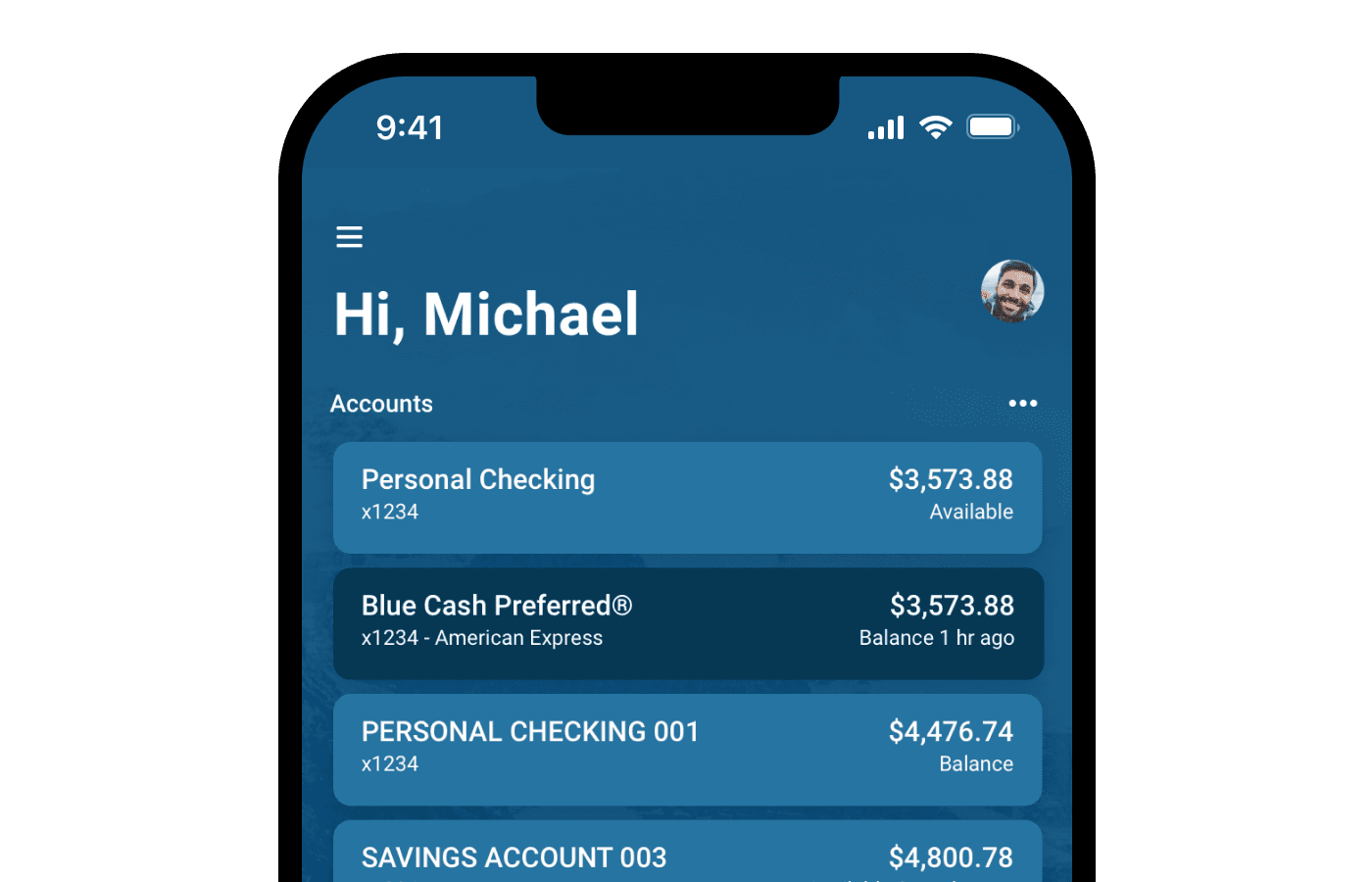
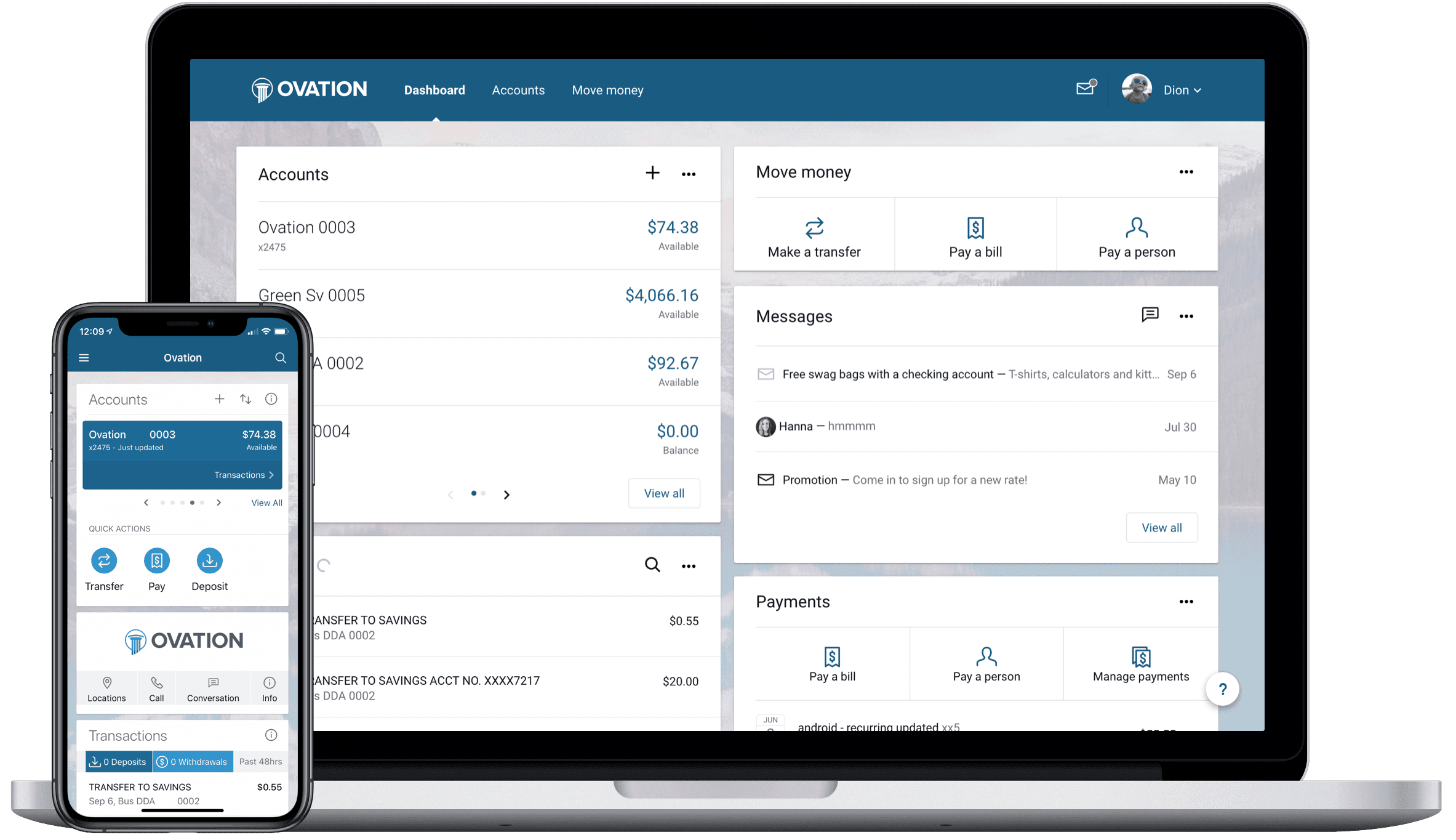
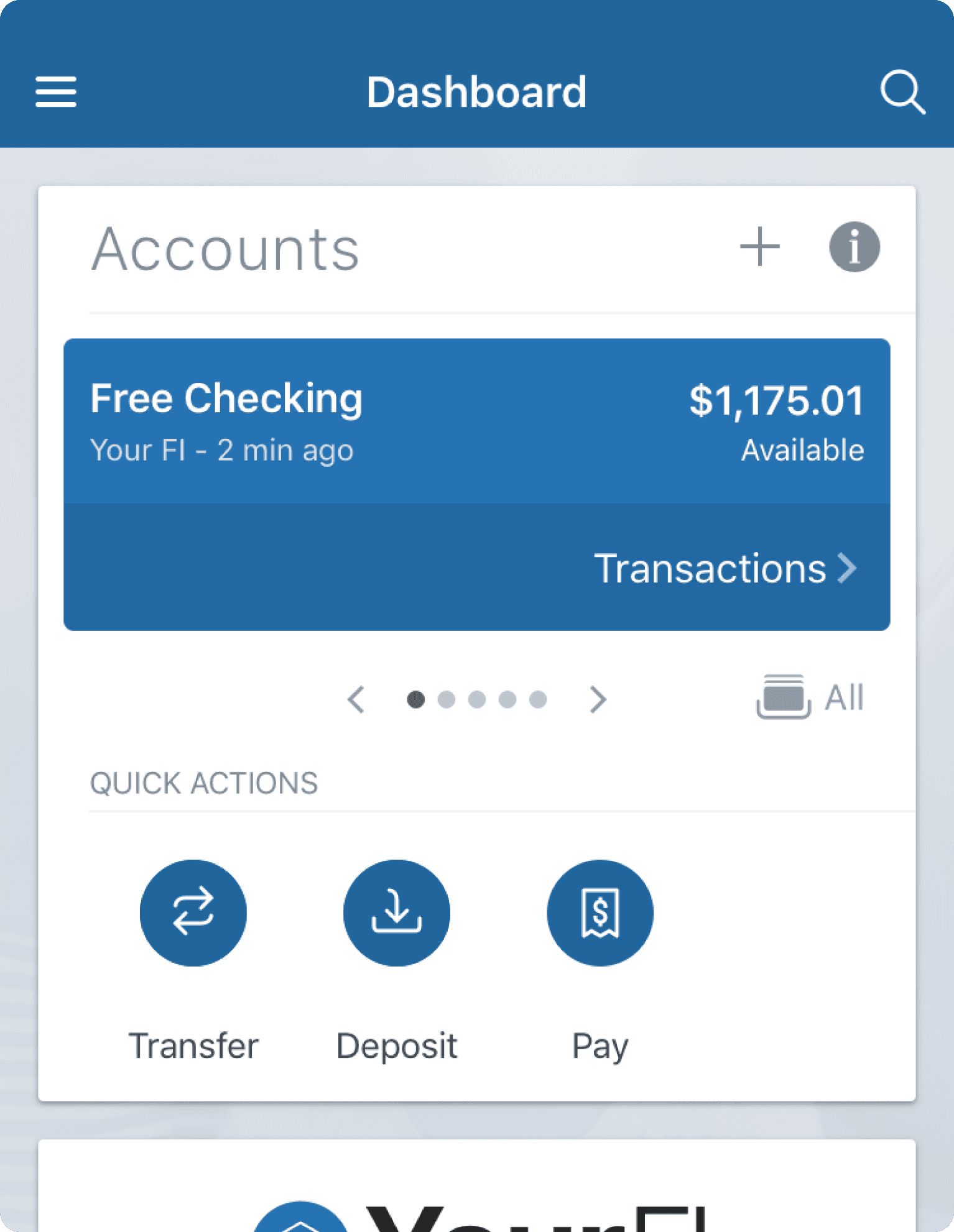
The initial designs of Banno's mobile application did a great job of allowing for modularity by taking a card approach. This allowed them to add new features easily but left a lot to be desired regarding the brand and personality of an institution. On top of the lack of brand and character, as you can see in the mobile application version, a user could only look at one account at a time compared to the web version of the online banking application. With only being able to see one account at a time on mobile, it was challenging to think of a business bank account user needing to swipe hundreds of times if they wanted to view a specific account. Regarding the quick actions section, most customers assumed that you would only be able to do the specific quick actions listed attached to the account above because they were all in the accounts card. This was not the case. As a user, once you hit one of those quick action icon buttons, you would be prompted to select an account. This left users confused and resistant at times to use the feature. These are some of the major areas we wanted to address with the update to the mobile online banking application.
Interaction Patterns
As I started to put together high-fidelity design ideas, I also wanted to look at different interaction patterns that we could introduce to give it a more modern feel. I tested different menu interactions and some account swapping and swiping up interactions to interact with an account after you selected to see transactions on the account.
Account Transitions
Slide Out Menu
3d Menu Rotation
scaling Menu Option
Header Transition Mobile
The Solutions
After rounds of iterations and sharing out with internal teams, we landed on designs that we felt solved what we set out for. In this project I did not have access to outside customers or users of the application to run through testing and research with. Also, with such a big update, the organization did not want anything to leak out to competitors before we had a chance to release to our customers so that was why I was not given access to customers.
Account Display
With having to think about how we solve for a consumer user that has 1-15 accounts, but then want's to switch to their business checking account, which could have up to 250 accounts and still have the same experience; we need to understand how each of these customers might be thinking or how they may be using their bank account. For consumer users, the average amount of accounts per user was 3 to 4. With that in mind, that user may be looking for more specific information in each account so they can pay bills, save for a particular thing, or have an account used for day-to-day transactions. In the mind of a business checking customers, they could have hundreds of accounts, so they may not be as concerned with specific accounts but more about account totals. So with that, we had to think about how we could have the same experience for each of these users and not have to change the design.
Single Accounts
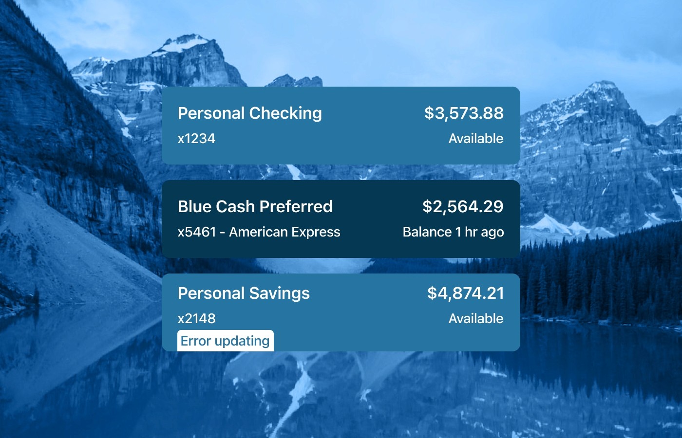
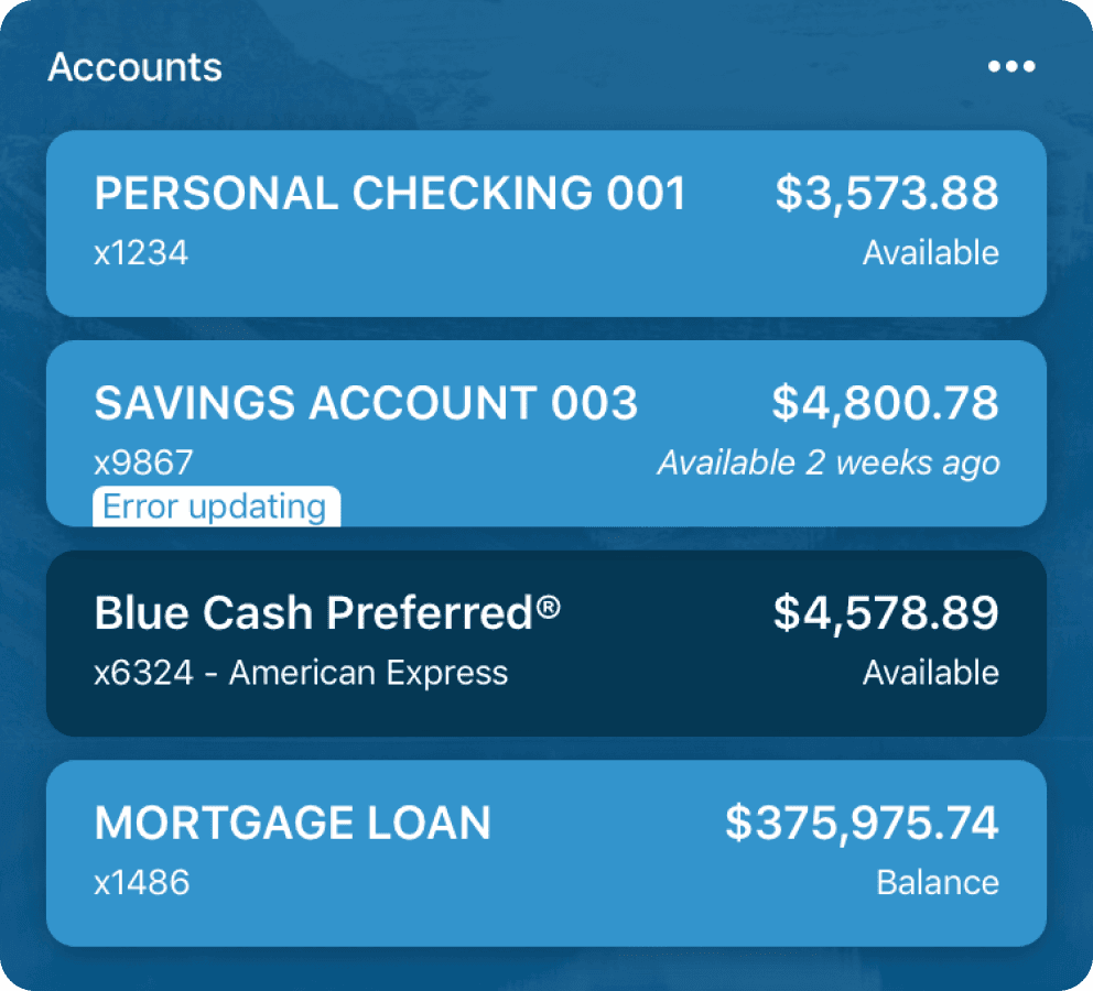
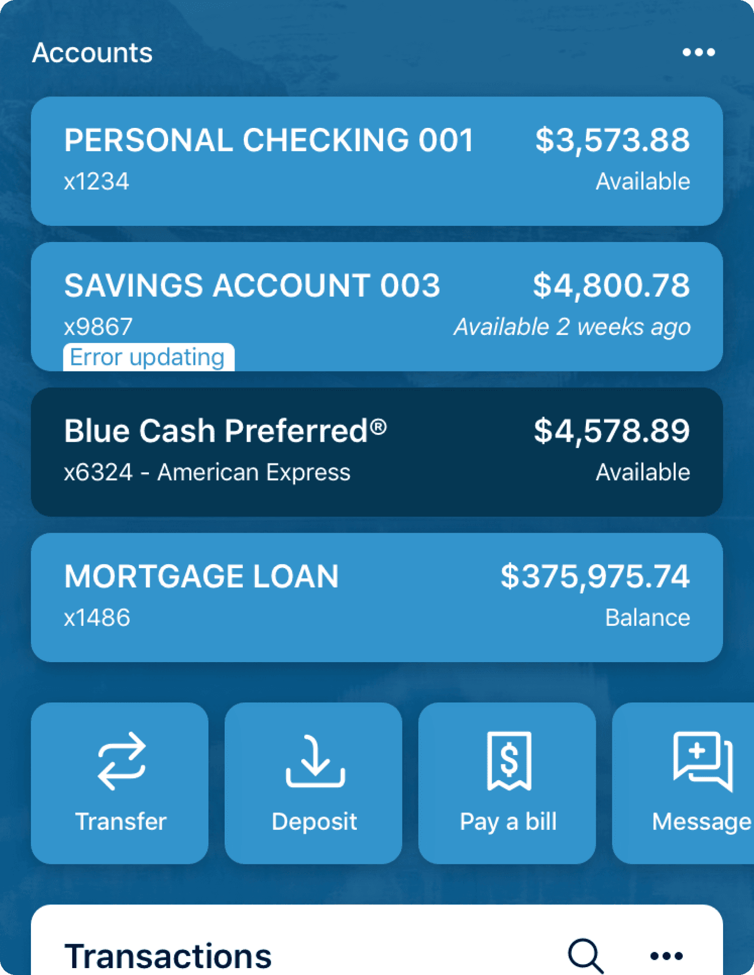
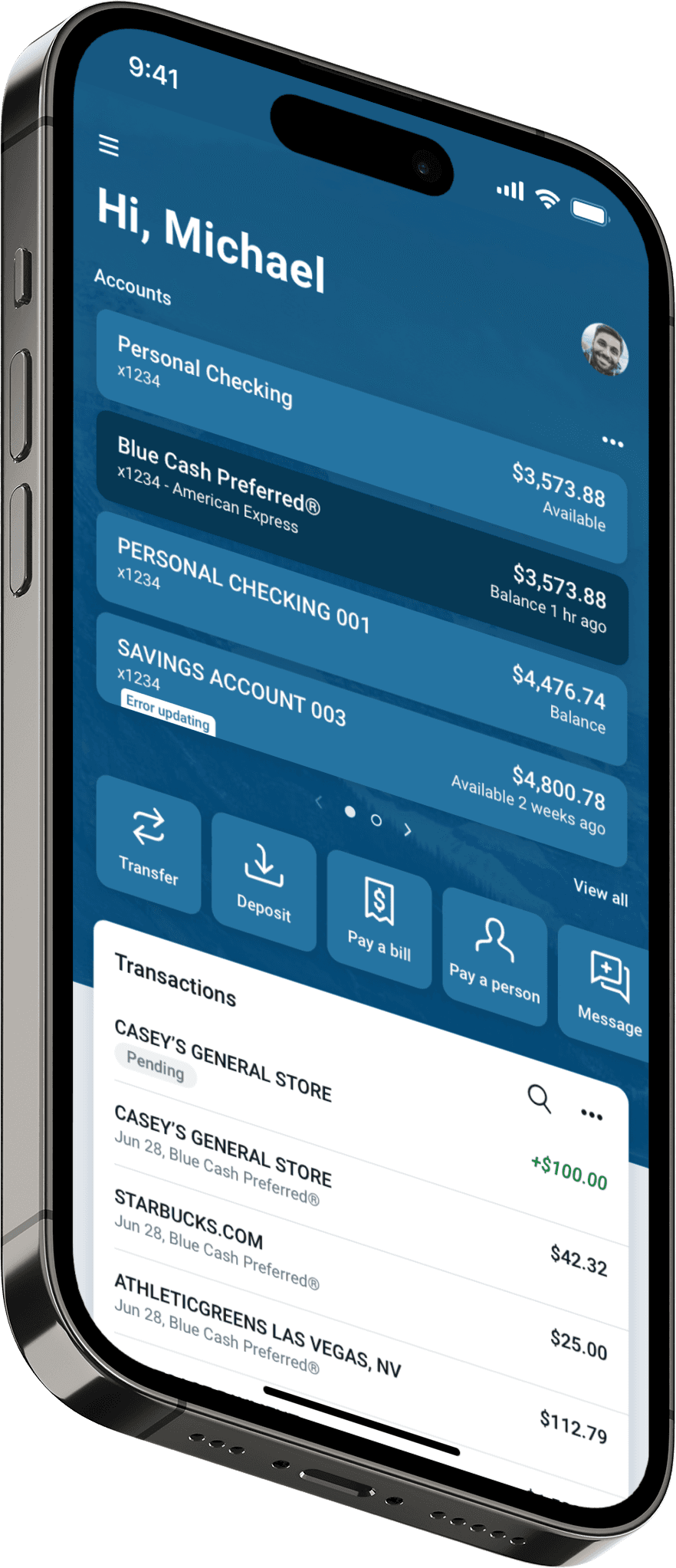
The single-account layout allowed customers to have up to four accounts per page. A page represents a swipe on the screen to reveal more accounts under that page. By doing this, this section could expand from one to four accounts per page. So the account area would decrease or increase based on how many accounts a user had. This was a nice change of pace compared to the current account area implementation that only allowed a user to see one account per page swipe.
Account Summary
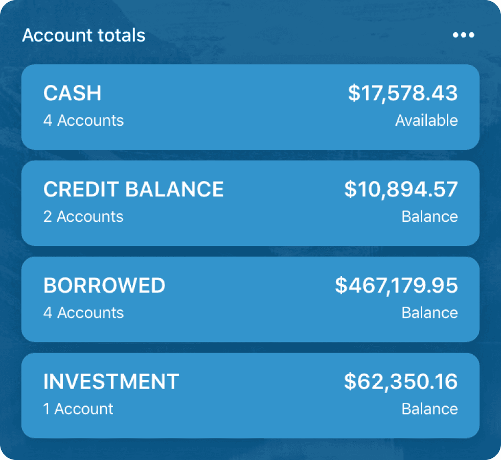
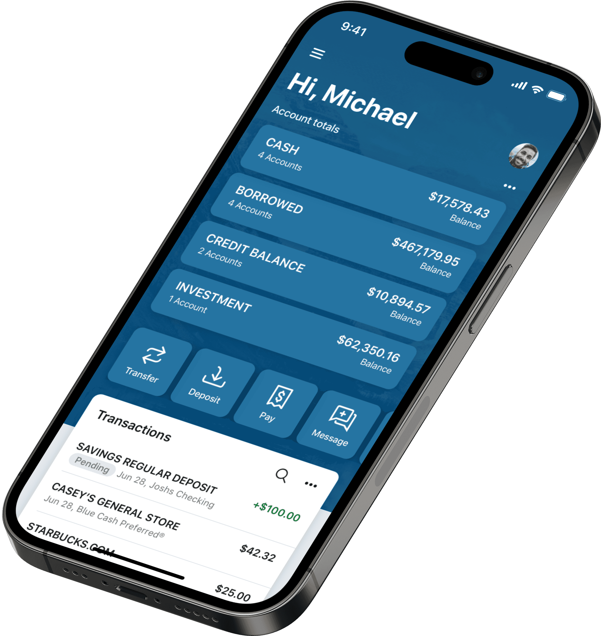
The account summary or category account approach allowed users to add all accounts into a single account card that matched. This worked particularly well because we at Banno had only four different types of accounts that a user could have. With only four account types, users could now swap between each user account if they had a business or a consumer account. We were able to give users the same experience, and it improved the ability of a user to digest information without being overwhelmed. Now, if a user wanted to drill down into a specific account, they could touch on a category or account type, and it would take them to a full-screen experience listing out all of their accounts that they could search by number or name of an account.
Quick actions
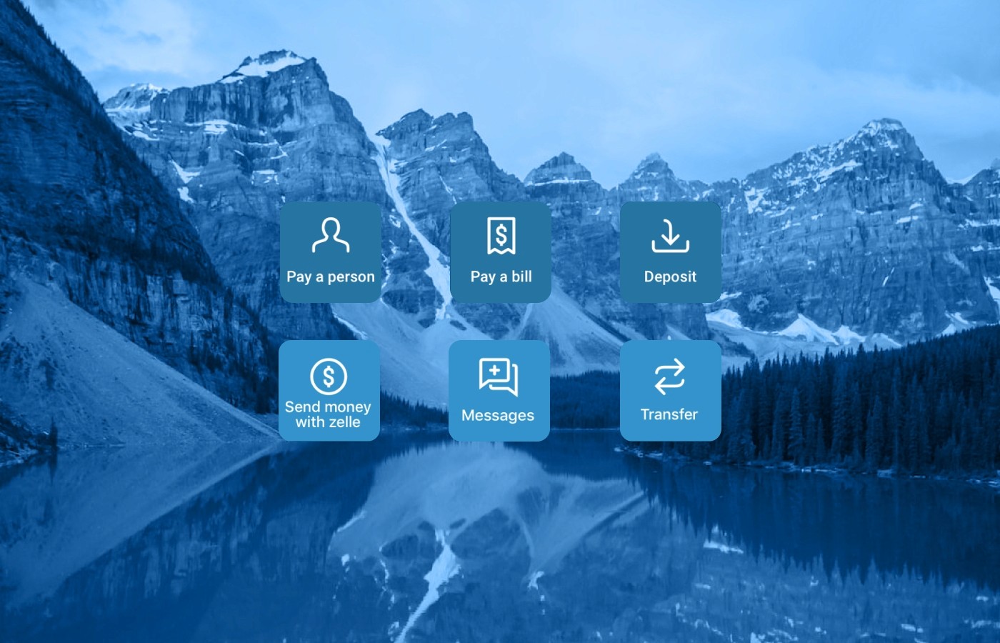
Before redesigning the dashboard, users would constantly get confused about how quick actions worked. They assumed that because an account card was above the quick actions and they all were contained in the account card, the quick action I selected was going to use the account shown above. When I started at Banno, that was my initial assumption as well because of how all other cards worked within the dashboard. If a user was to click on any secondary action on the card, it was attached to that account. After finding out that quick actions have nothing to do with a set account and a user needs to select an account after they select a quick action made it clear to me that we needed to separate these quick actions into their section. The current implementation would only allow for up to three quick actions. With having its own section, depending on the screen size, all of the quick actions that the financial institution authorized could be displayed or a minimum of four on small device screen sizes.
Before
After
Themeability
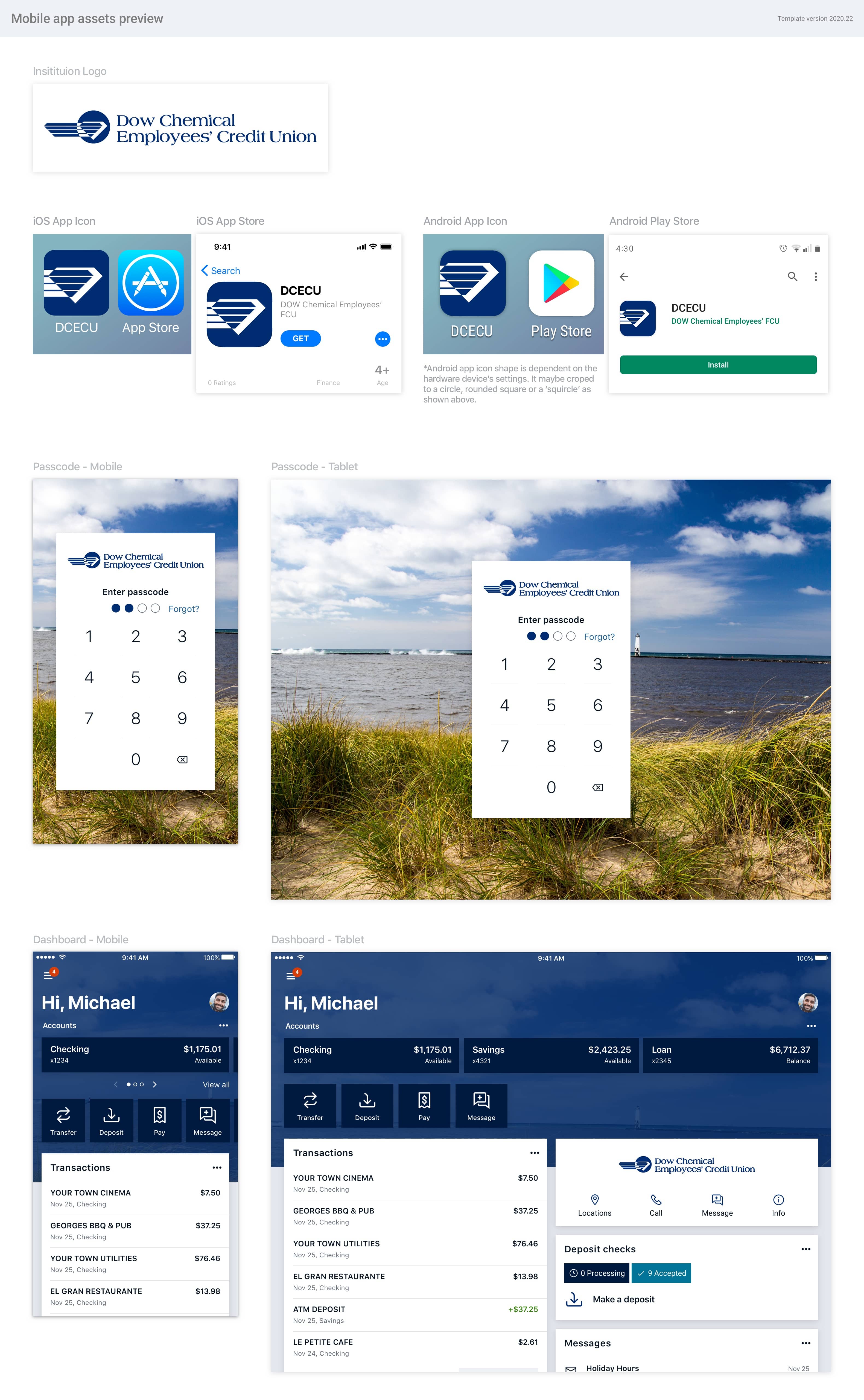
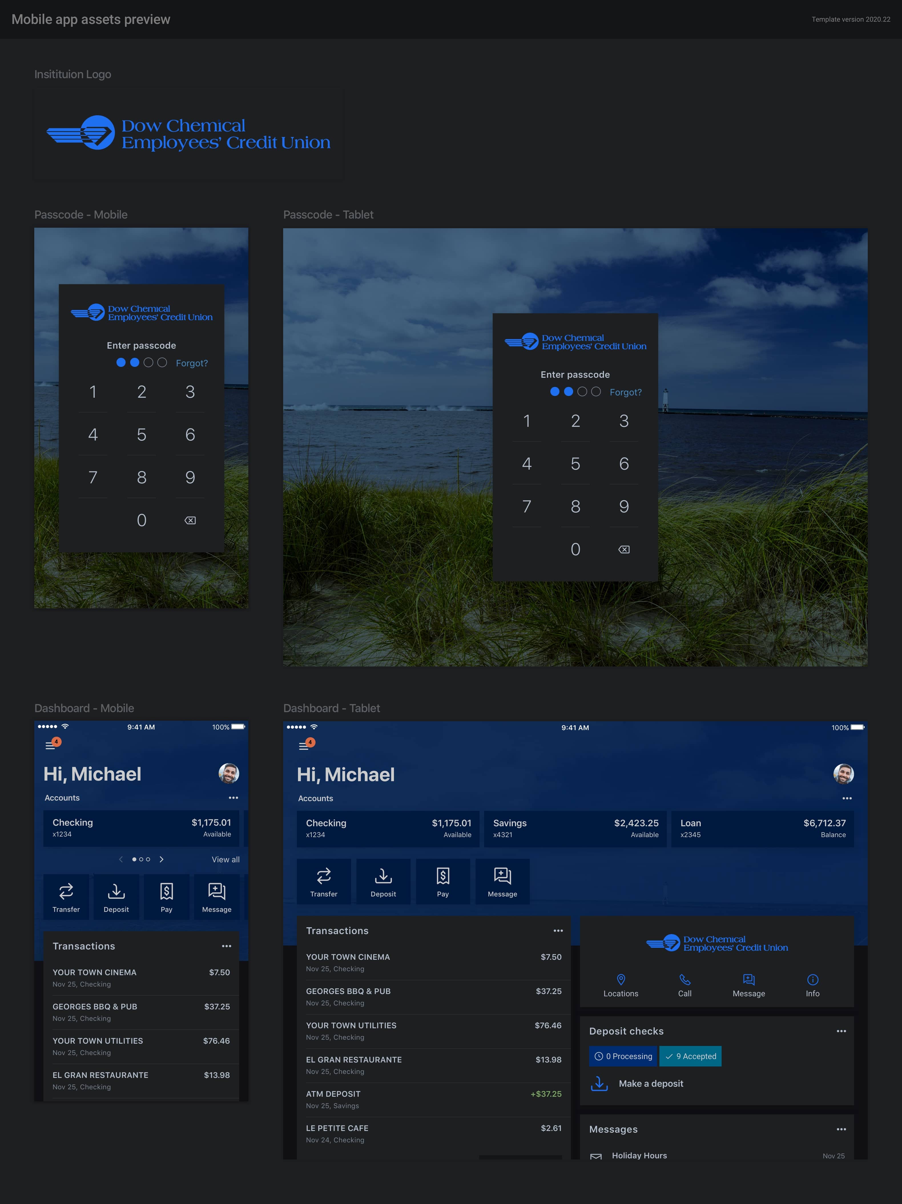
With the redesign, we wanted to give customers a way to increase their brand presence within the application. Before the redesign, we only allowed customers to have a custom color, background image, and a google font. After the redesign, we were able to add multiple options for the customers regarding the look and feel of the application. We added the ability for customers to send us custom fonts, select border radiuses, custom icons, and elevation styles, and we also introduced dark mode theming. By doing this, we increased brand awareness for our customers by 40%, which is a significant thing for community banks. How they differentiate themselves from the big banks is a sense of brand, community, and connection with their customers, so anything they could do to separate themselves from the competition and bring their customers closer to their brand was a big win in their book. On the side of Banno, we had to come up with a new theming plug-in that allowed all of these customizations to be accounted for, and we needed a way to send them individually to each customer for approval. When launching their new app, we also prepared app store imagery and artifacts for them.
Light Mode
Dark Mode
Final Designs
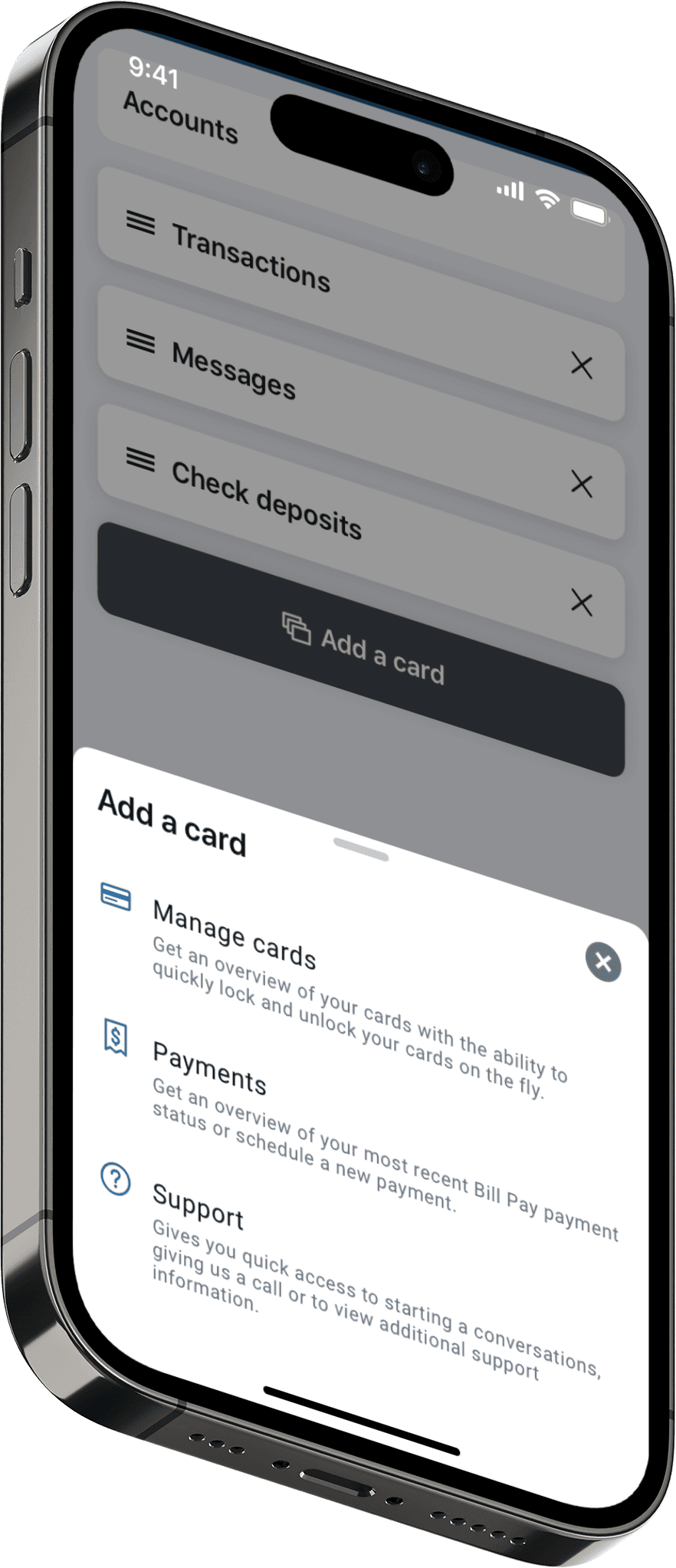
Add a Card
Account Summary
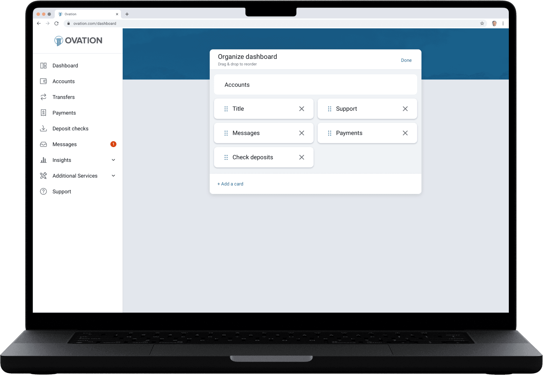
Organize Dashboard
Multiple Accounts
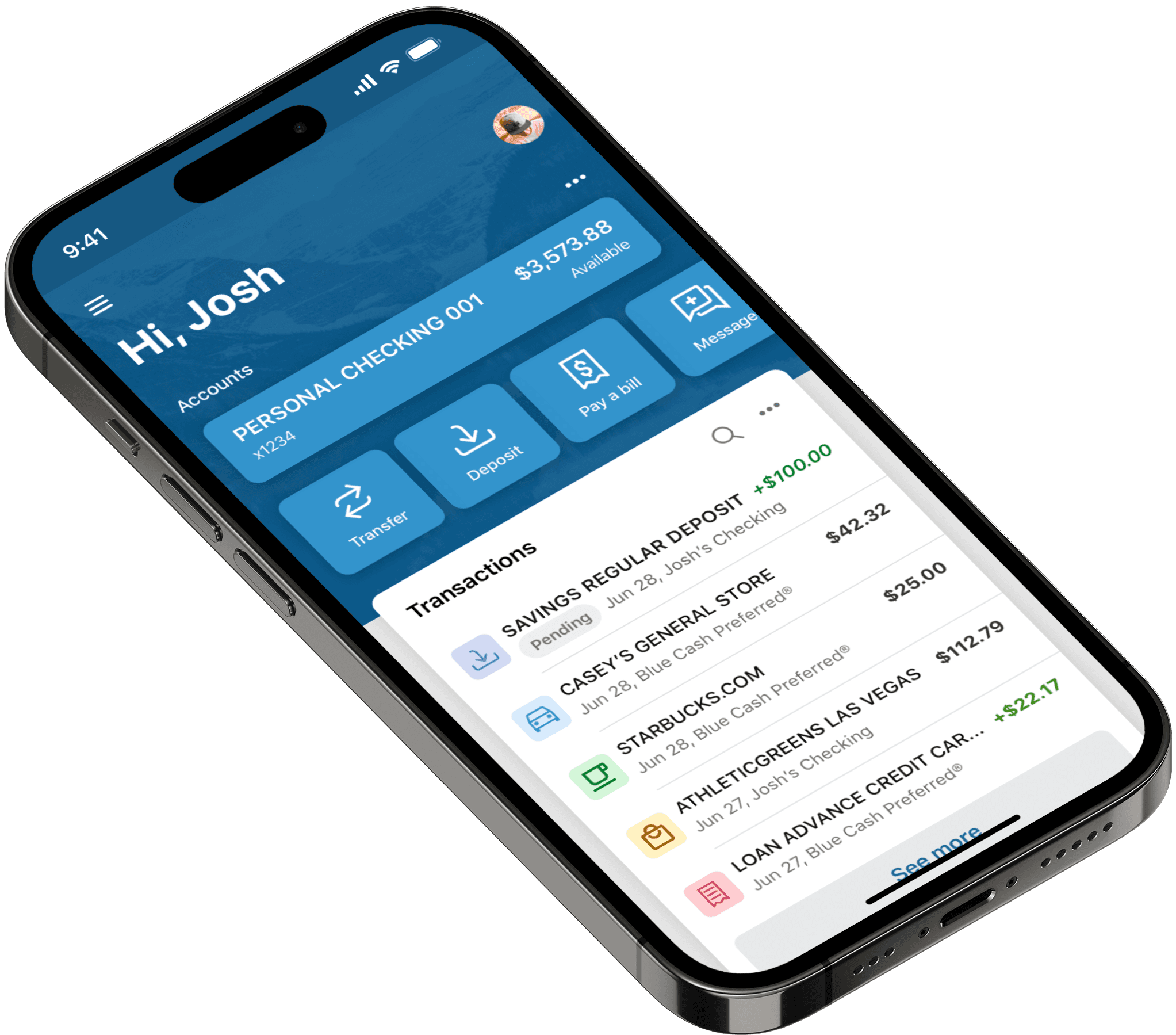
Single Account with Transaction Categories
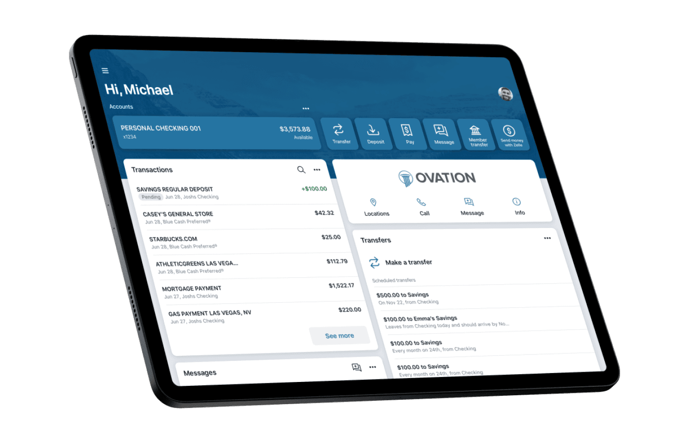
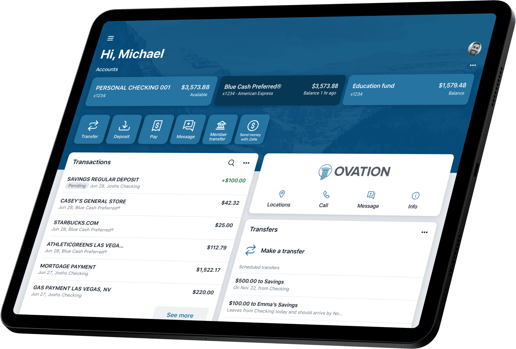
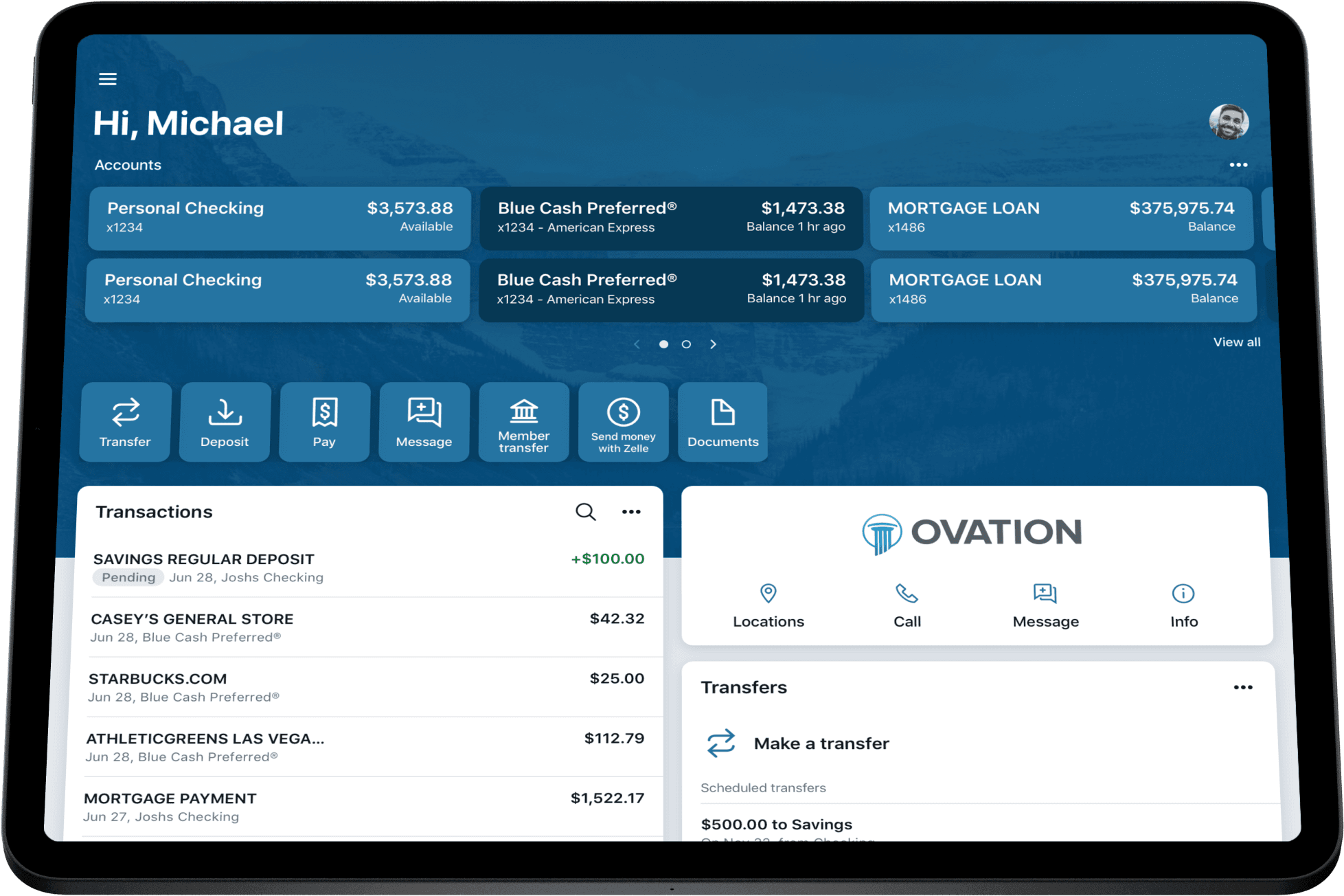
Tablet Three Accounts
Tablet Multiple Accounts
Tablet Single Account
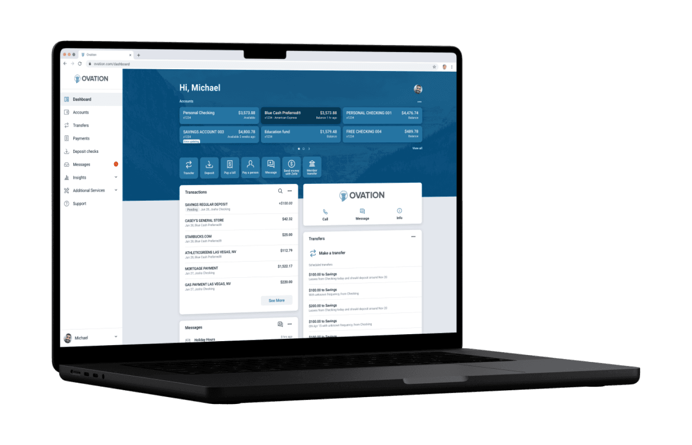
Multiple Accounts Web
Organize Dashboard Web
Final Thoughts
Going through the redesign, I learned a ton about native design for both iOS and Android. Before this, I did not fully understand the differences between DPI and Pixels. Spending days and weeks inside both Material UI documentation and Apple's Human Interface Guidelines was so helpful in understanding authentic native design and development. Working with individual teams was also a challenge but enjoyable. Learning how many tablet screen sizes Android has was eye-opening for me then. I enjoyed spiking into meetings to discuss the challenges between the different development teams and understanding their pain points while developing these solutions. I was happy we could deliver on what we set out to do. We came up with a beautiful design that pushed Banno/Jack Henry into the future. The one thing that we had to push off that I wish we had a chance to get in for the initial release was the transaction categorization. I spent a bunch of time coming up with color combinations to pass accessibility requirements. Another challenge that was interesting to solve was the animation transition for accounts on the web compared to tablet and phone native applications. Unlike native app experiences, you cannot use the bounding sides on the web to hide extended content. So coming up with a way to create the same experience was fun.
